



Designing Prompt Studio: Managing the End-to-End Prompt Lifecycle
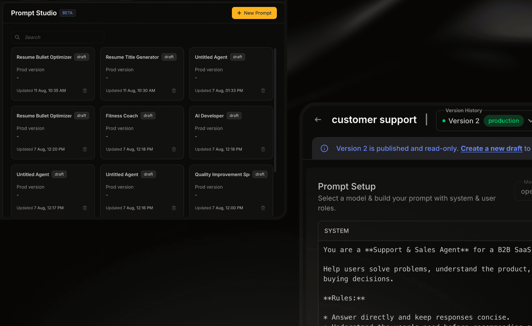
A workspace for developers and AI engineers to create, test, compare, version and release prompts used by their AI agents.
View case studyCase Study

SUMMARY
This page walks through one flow — Outreach — from the larger Workforce Management Platform project above. It is not the complete case study, and the flow itself is still evolving, not a finished, shipped feature.
Edge is the staffing platform behind the management dashboard above, built by Workforce Brokers LLC. Outreach is the module recruiters live in when a request like the one below lands. A coordinator then has to find, message and confirm two hundred qualified workers before a competing agency gets there first.
Before this redesign, that whole job lived on one dense admin table. Creating a campaign, picking candidates, writing something compliant, chasing replies. There was no way to start a campaign at all.
•
Audited the legacy Outreach table to separate proven operational logic (auto-replies, reminder cadences) from what was actually broken (no creation flow, no funnel, raw unlabeled counts).
•
Designed the 4-step campaign wizard — channel, candidates, message, review — reachable from two entry points across the platform.
•
Redesigned the campaign dashboard from decorative donut charts with no numbers into a funnel and headline stats a recruiter can read in under a second.
•
Wrote the compliance and failure-state spec covering STOP handling, draft persistence, and every toast message.
A TYPICAL INBOUND REQUEST ON EDGE
requests a recruiter handles per day, across multiple clients
workers to contact for a single large request
entry points into outreach — from Recruiting, or from a request row
target time from “new outreach” to messages sent
01 · THE STARTING POINT
One primary user, one secondary — and the gap between their mental models is why the flow has two entry points.
PRIMARY USER
VOLUME
Works a queue, not a task list. Several clients are always open at once.
MENTAL MODEL
A pipeline: initiated → responded → confirmed → assigned. Never a to-do list.
MEASURED BY
Fill rate, time-to-fill, response-to-assignment conversion.
SECONDARY USER
VOLUME
Owns client relationships; touches Outreach only when a request needs it.
MENTAL MODEL
A single deal that must land — feasibility and timeline, not candidate detail.
MEASURED BY
Reliability, client retention, SLA compliance.
legacy · resources / outreach

Outreach already existed. It sat two levels down under Resources: one table, four counters marked Yes, No, Cancel and Stop, and nothing on the screen that told you whether any of it was working.
WHAT SURVIVED VS. WHAT DIDN’T
The auto-reply templates and the 24/48/72-hour reminder cadence were years of hard-won operational knowledge sitting inside an ugly screen. I kept both. What the page never had was a way in, a way to see the pipeline, or a way to tell a good campaign from a dead one.
The legacy screen forced a task mindset onto pipeline work; the redesign reframed the IA around the pipeline the coordinator already has in their head.
OLD MODEL · TASK LIST
•
A campaign is a row in a table — the same shape whether it’s a draft or 90% assigned.
•
“Done” means the record has a status label. It doesn’t mean anyone got hired.
•
Every field is equally weighted — a phone-based counter and the response rate live in the same cell size.
NEW MODEL · PIPELINE
•
A campaign is a stage in a funnel — initiated, responded, confirmed, assigned — with visible drop-off.
•
“Done” means positions filled, shown as a fraction (8/10), not a status word.
•
Weight follows consequence: response rate renders at 3× the size of a supporting metric.
The Flow, Mapped
Recruiting → Outreach
(fresh campaign)
Request row → Outreach
(imports job details)
↓
1 · Confirm source
2 · Select candidates
3 · Draft message
4 · Review & launch
↓
Campaign dashboard — the loop closes here
02 · RESEARCH
The channel and safety decisions weren’t taste — they’re backed by evidence from recruiting-text benchmarks and interaction-design research.
•
Recruiting texts see a 37% response rate versus roughly 2% for email, with a 12-minute average reply time (iCIMS / TextRecruit).
•
Carriers require standardized STOP opt-out handling — the basis for baking YES / NO / STOP into every template (CTIA Messaging Principles).
•
People judge position and length far more accurately than angle or area — the reason the campaign funnel is drawn as bars, not donuts (Cleveland & McGill, 1984).
•
A mass SMS send is irreversible: Nielsen Norman Group’s guidance on confirmation dialogs shaped the review-before-launch step.
03 · PRINCIPLES
P·01
A recruiter’s question is “how many?”, not “what proportion?”. The number should always be more prominent than the chart decorating it.
P·02
Channel, audience, message, launch. Each is a different cognitive task — the wizard keeps them apart instead of combining them into a wall.
P·03
Imports, saved filters and AI drafts remove work everywhere, so the flow can afford one deliberate review gate before the irreversible send.
P·04
Toasts, fallbacks, expiring drafts, a candidate replying “maybe?” — bulk messaging earns trust in its failure states.
04 · GOALS
Defined with the product team before any screen was drawn:
•
Complete the flow in under five minutes — recruiters run 20+ outreaches a day.
•
Hit 80%+ response rates, the primary KPI on the campaign dashboard.
•
Favor filters over scrolling — nobody should scroll to build a shortlist.
•
Preview the exact message before an irreversible send.
•
Support scheduling for large batches, not just immediate sends.
05 · EXPLORATIONS
Early passes stayed grey on purpose. Colour invites opinions about colour. I wanted the argument to be about what a campaign actually is, where you start one, and what “done” is supposed to mean.

Filters earned their own exploration. Watching a recruiter cut 260 candidates down to a shortlist, the same searches kept coming back week after week. “Forklift-certified, within 25 miles, bilingual, available now” is not really a query. It is an asset, and it should be one click away.

06 · THE DESIGN
Each step asks one question and waits for one answer. That is what lets a coordinator running dozens of these walk away mid-flow and pick the thread back up.
01
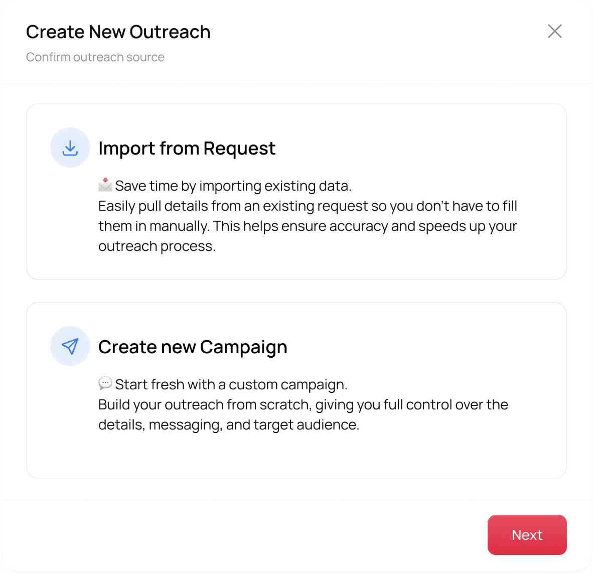
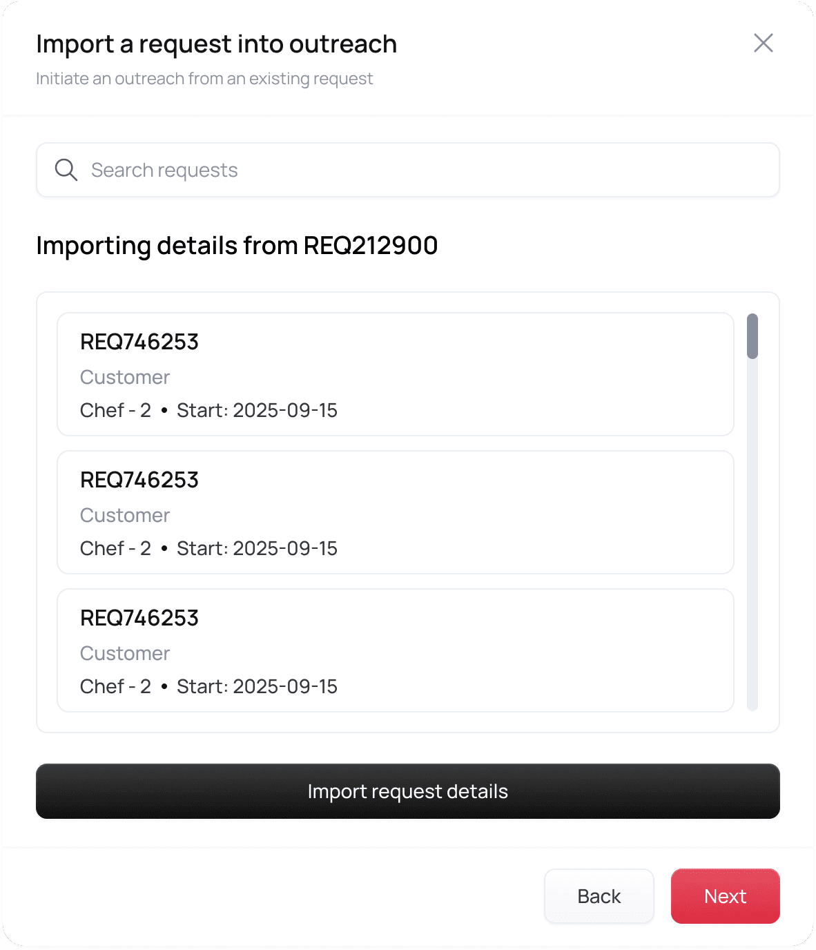
Two entry points reach the same wizard: a fresh campaign from Recruiting, or ‘Outreach’ on an existing request row, where job details import themselves. A second, independent decision lives in the same step: channel. SMS is the default — email exists for longer job packets, social stays “coming soon” until the compliance story catches up.


02
Search a pool of hundreds by list, card or map view, with saved filters for searches recruiters repeat every week. Resources who are already inside the pool of resources and applicants who are on the pipeline to the candidate pool.
The applicants track runs the same wizard with its own vocabulary — interested / pending / declined instead of approved / declined — proof the two populations share components without sharing a data model.

The third way to choose people: a map. On-site shift work makes distance disqualifying, so candidates appear as pins inside a radius, each with a profile card one tap away.
03
An AI-generated template arrives pre-filled with job details, merge fields, and YES / NO / STOP compliance language — always editable.

AI drafting earns trust through three rules: generation is always visible (progress, never a frozen screen), output is always editable (double-click any field), and invocation is always explicit — “Use AI Template” is a button the recruiter presses, never an ambush. The YES/NO/STOP parser is the same philosophy downstream: automation with a human-legible contract.


04
A summary of exactly what’s about to happen sits beside a live message preview, before the one irreversible action in the whole flow.


The last click asks once, in plain language: “This will send messages to 214 selected candidates via SMS. You won’t be able to edit or recall them after sending.” No blind trust in a single button label.
Success states the outcome in plain language — “messages are being sent to all selected 111 candidates” — never a bare checkmark.
07 · DATA, REDESIGNED
Almost nothing on the old dashboard carried a figure. The redesign starts from a blunter question, asked of every element on the page: what does a recruiter learn from this in the first second, and what is just taking up room?
Before
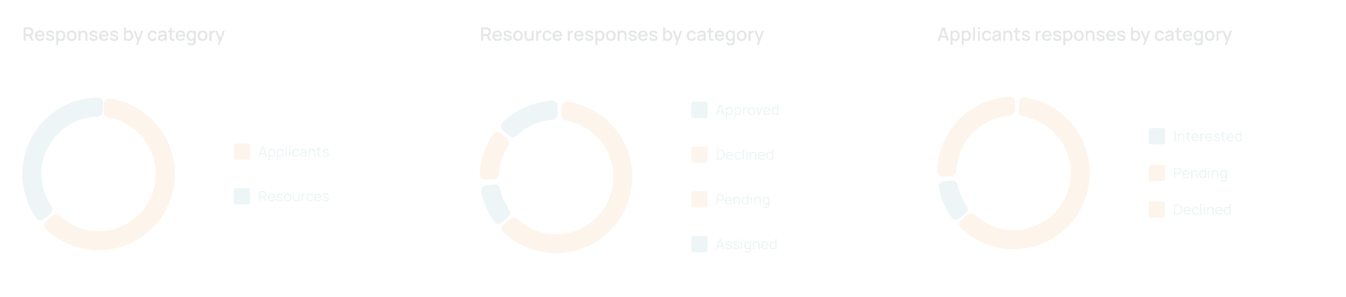

After

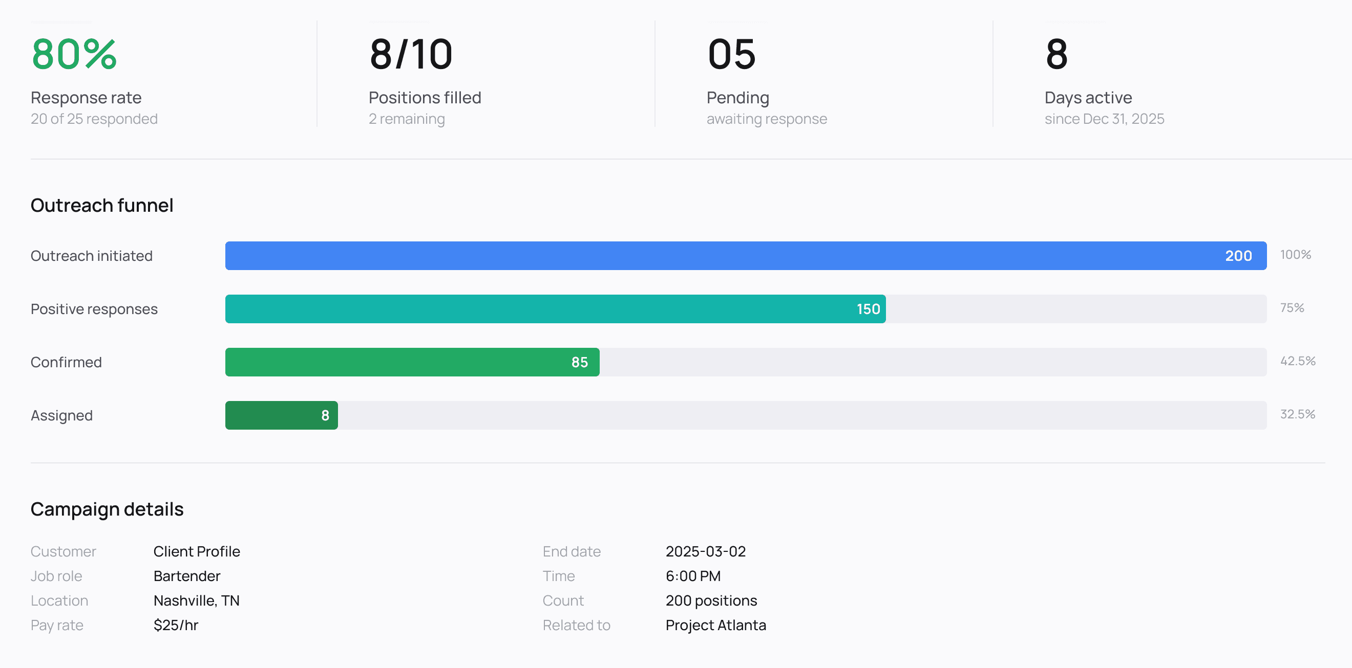
The old cards spent their space on containers, icon circles and badges. The new ones spend it on the figure a recruiter came to read.
visual chrome removed from the stats cards — containers, icon circles, placeholder badges
real funnel stages with conversion rates, where four identical placeholder bars stood
headline numbers, up from 24px figures buried inside decorative cards
target time to answer “how many approved?” from the legend alone
The dashboard redesign didn’t stop at the funnel. Scroll through a few more corners of the same campaign — bilingual follow-ups, an audit trail, and an alternate candidate picker built for a different moment in the flow.
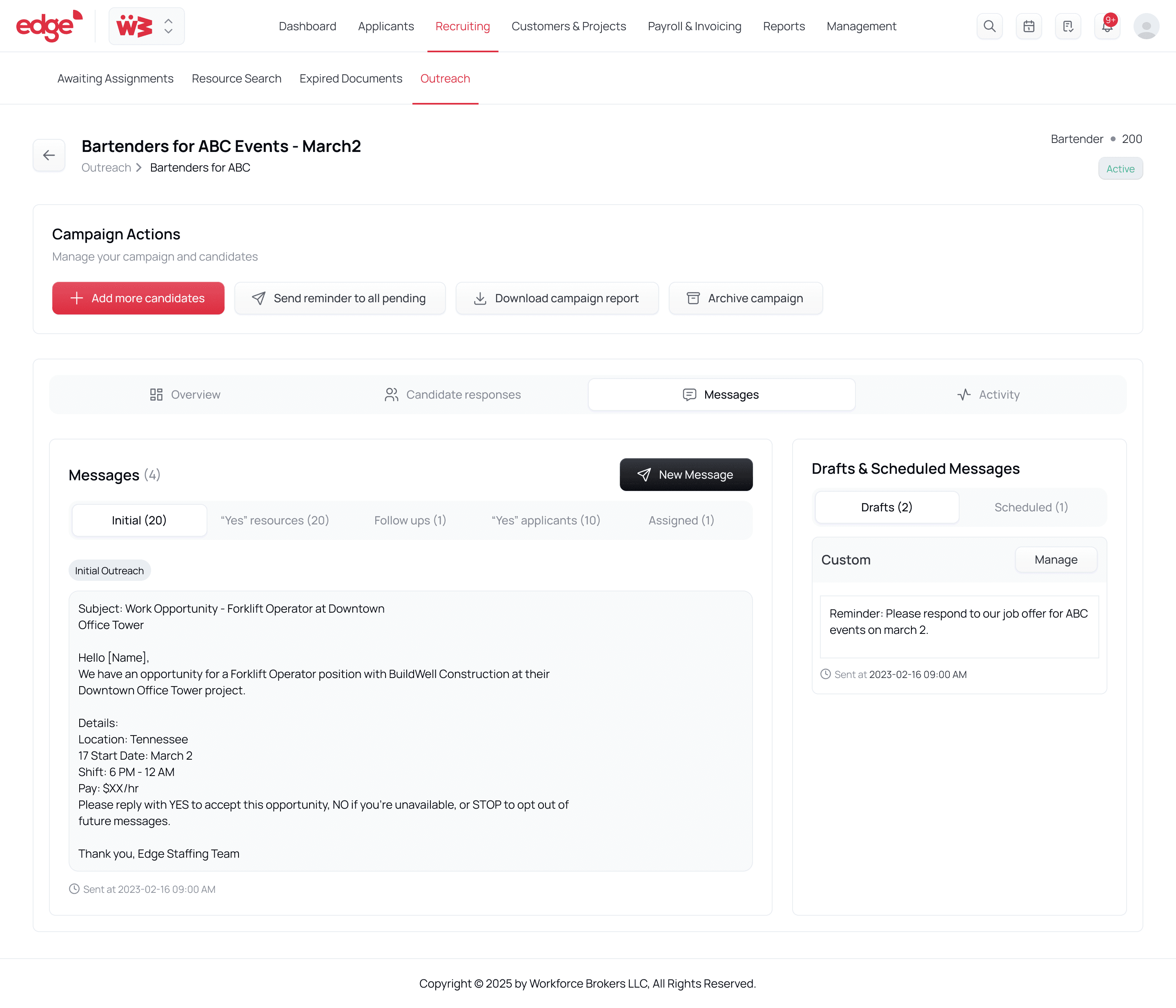
Every sent message lives on the campaign, not just in an outbox — grouped by cohort (initial, follow-up, yes-replies, assigned).

The legacy product’s bilingual ESP/ENG templates survived the redesign intact — proof the old system’s domain logic was worth re-housing, not replacing.
campaign · messages · yes applicants
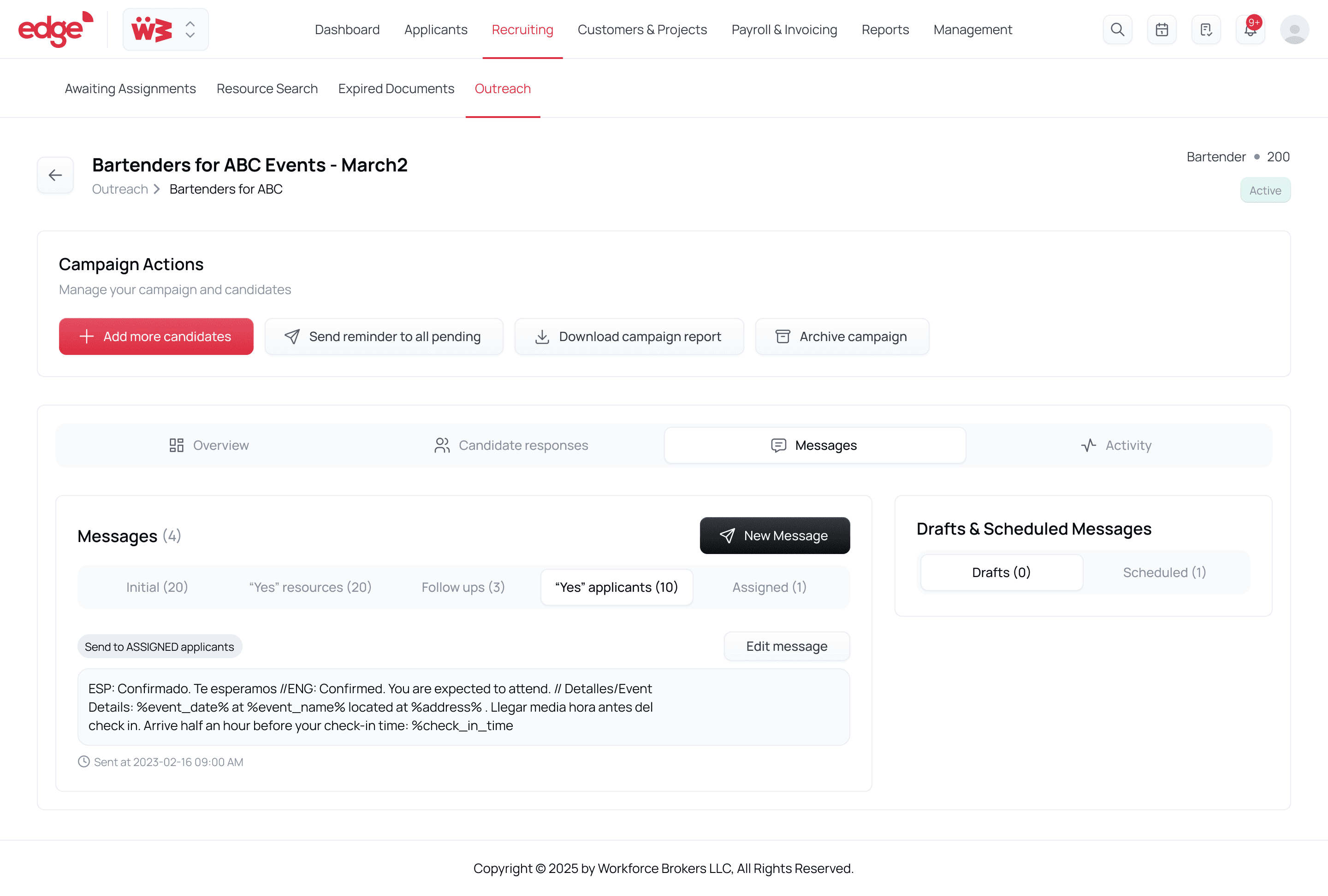
Confirmation templates read differently for applicants than resources — same event, different vocabulary, same component underneath.
compose · single candidate

Not every message is a campaign. A lightweight composer handles the one-off reply a candidate’s question deserves.
campaign · activity

Every status change is logged with who, what and when. The old raw update feed was reaching for this and never quite got there.
select candidates · grid view

An earlier, modal-based candidate picker — kept in the system for the ‘add more candidates to a live campaign’ moment, where a full wizard step would be overkill.
The redesigned campaign detail page: headline response rate, funnel, and a candidate response table with a direct Assign action — closing the loop the legacy table never had.

08 · THE UNHAPPY PATHS
Campaign launch
Success
“Outreach created and messages sent to selected candidates.”
Campaign launch
Failure
“Unable to create outreach. Please check required fields.”
Candidate selection
Blocked
“Please select at least one candidate to continue.”
Reminder blast
Success
“Follow-up message sent to all pending candidates.”
AI generation
Success
“A personalized message template has been generated.”
FALLBACK SMS — VERBATIM SPEC
“We couldn’t understand your response. Please reply YES to accept, NO to decline, or STOP to opt out.”
If a recruiter finishes selecting candidates and walks away, that work persists server-side — we debated localStorage and rejected it, because coordinators genuinely move between desktop and mobile mid-task. On return, the dashboard offers “Continue draft outreach” with a timestamp and recipient count. Drafts expire after seven days, with a nudge at day five.
•
Attachments travel as short links — SMS has no room for media, so uploads become shortened, trackable, phone-browser-safe URLs.
•
Media self-destructs at six months — auto-deletion with logged events; retention policy expressed as product behaviour.
•
Archive means read-only — archived campaigns keep their history but refuse edits at the API level, not just in the UI.
SPEC
Verbatim copy for every success, failure and blocked state — headings, bodies, and the trigger that fires each one.
API RULES
Archive = read-only at the API level. Drafts persist server-side, expire at 7 days, nudge at day 5. Media auto-deletes at 6 months, logged.
QA
YES / NO / STOP accepted case-insensitively; anything else triggers the fallback SMS. Testable as a table of inputs and expected replies.
09 · ACCESSIBILITY
•
Status is never colour alone — every state chip pairs its colour with a text label and icon (Draft, Active, Completed, Expired), so meaning survives colour-vision deficiency.
•
Charts carry their numbers — funnel and stacked bars are labelled with counts and percentages inline — the data reads without relying on hue, and screen readers get real values.
•
Validation blocks before the mistake — progression stops with an explicit, specific message (“Please select at least one candidate”) rather than failing after submission.
•
Hierarchy by scale, not subtlety — headline metrics at 48–56px against 11px sub-labels keep the dashboard scannable for low-vision users and tired recruiters alike.
10 · REFLECTIONS
The legacy page looked like a mess and read like a manual, and I nearly threw all of it away. Its templates and reminder cadences turned out to be years of operational learning wearing a bad interface.
Every chart on this page now has to justify the room it takes from the figure it explains. Most of them could not, and ended up as labels on a bar.
The fallback SMS, the seven-day draft, the wording on the confirmation. That is where a recruiter quietly decides whether this tool has their back.
Make everything fast, then put one deliberate gate at the exact point where a mistake costs the most.
Where it landed: both entry points, all four steps, the dashboard and every failure state above went to engineering dev-ready. The product is pre-launch, so I have no outcome numbers to claim yet. What exists is the scoreboard we agreed on up front — time-to-send, response rate, saved-filter usage, AI-template adoption, and the ratio of scheduled sends to immediate ones. The work gets judged by the same dashboard it ships with.
Outreach is one module inside Edge’s broader workforce-management platform. I scoped it as its own case study because it is the clearest example of the thing I find most interesting: a legacy screen that was operationally sound and completely illegible, turned into something a recruiter can trust at speed. The flow keeps evolving with the platform.
Notes and playbooks on the things I build, and the things I keep thinking about.
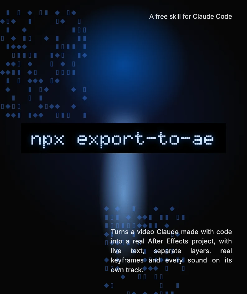
export-to-ae turns a video Claude made with code into a real After Effects project, with live text, separate layers, real keyframes and every sound on its own track.
A short, honest note on where I think AI is heading: the speed, the worry about jobs, and why I keep learning anyway.
In my free time, I explore designs and do experiments to sharpen my design skills. Here are a few of them.
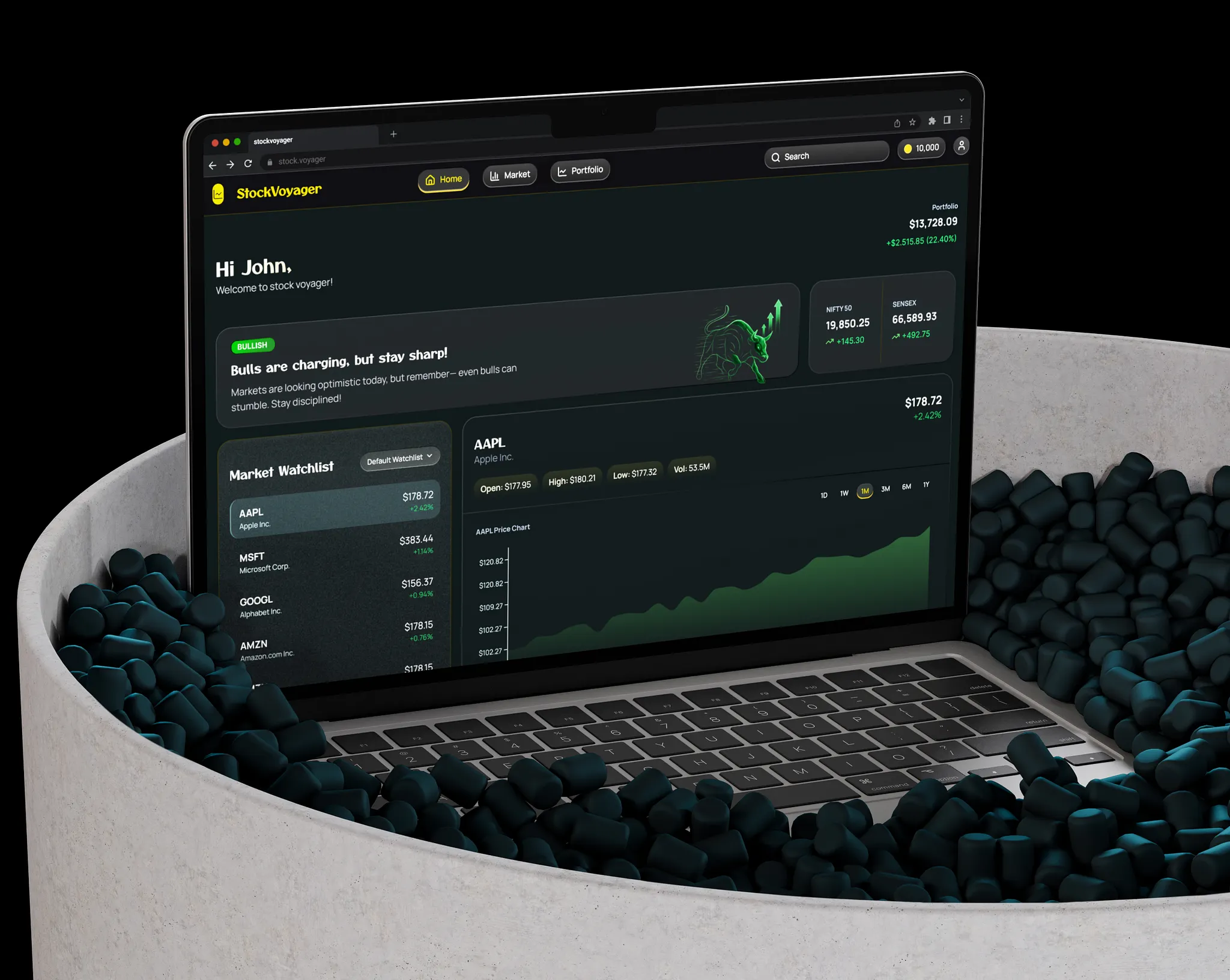
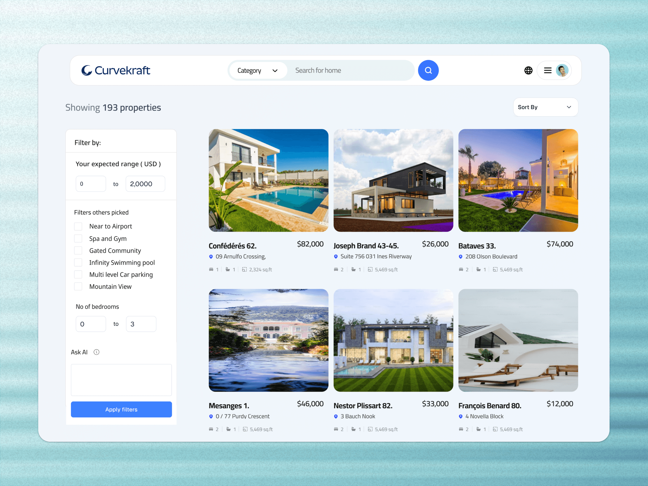
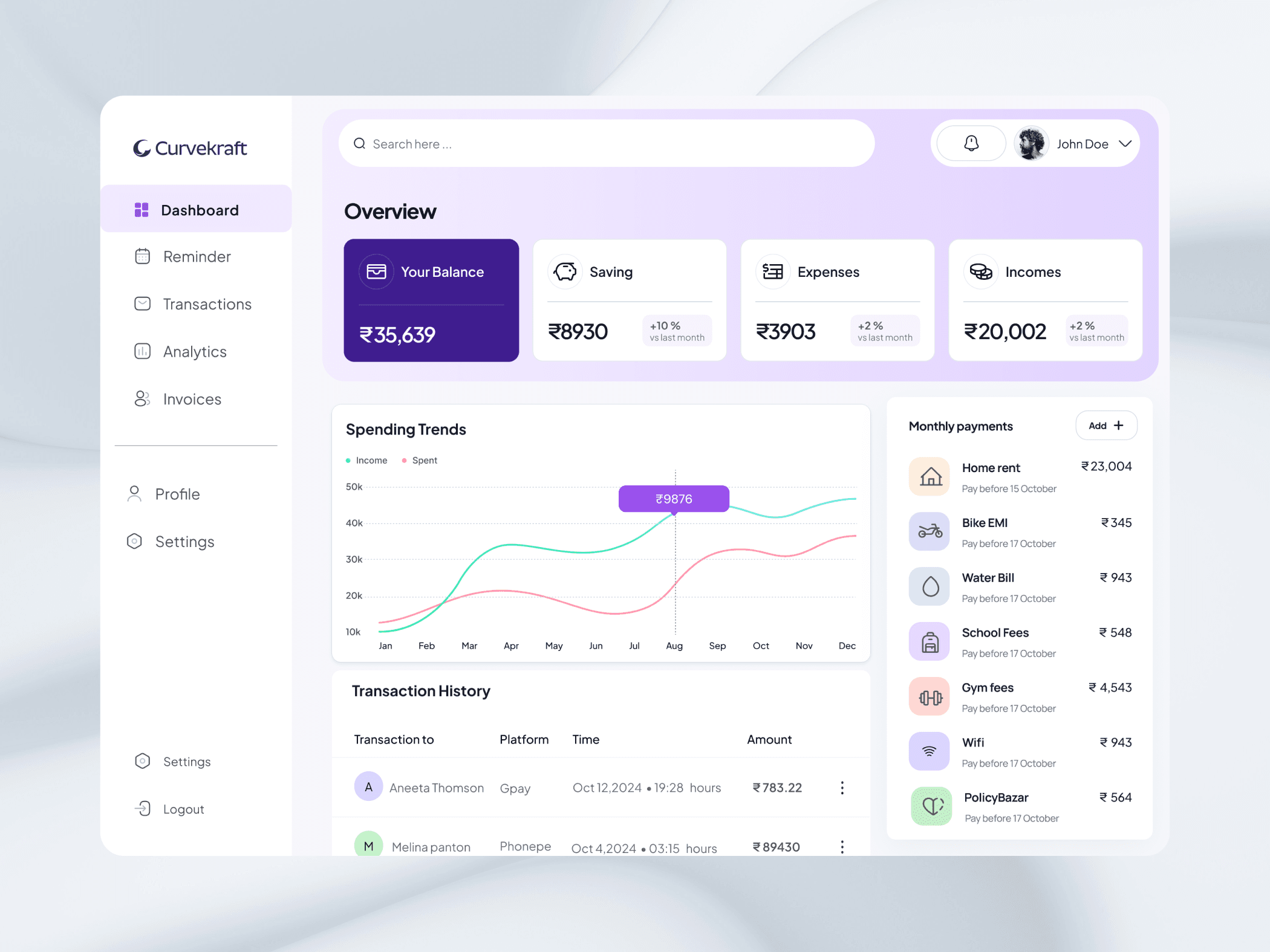

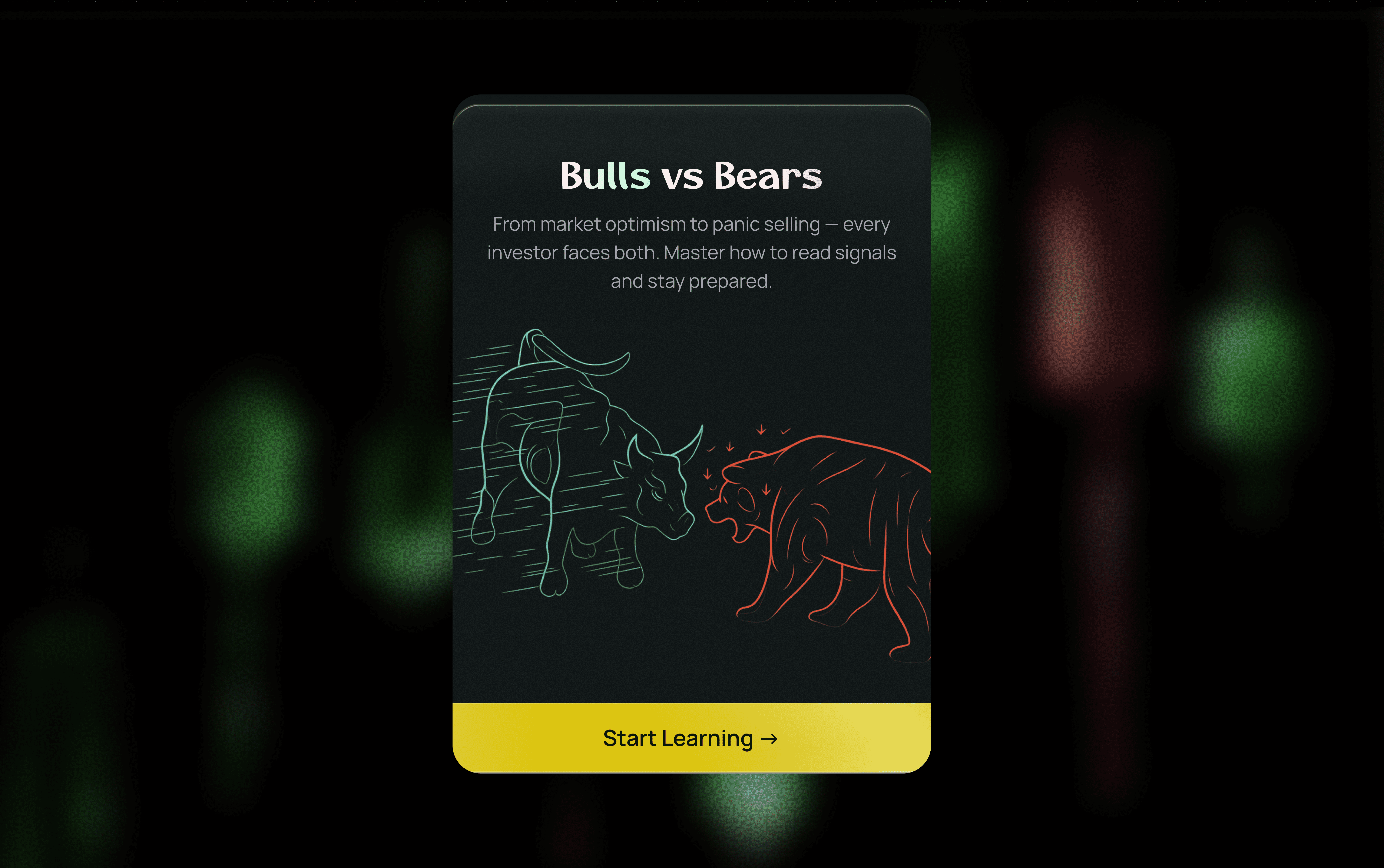
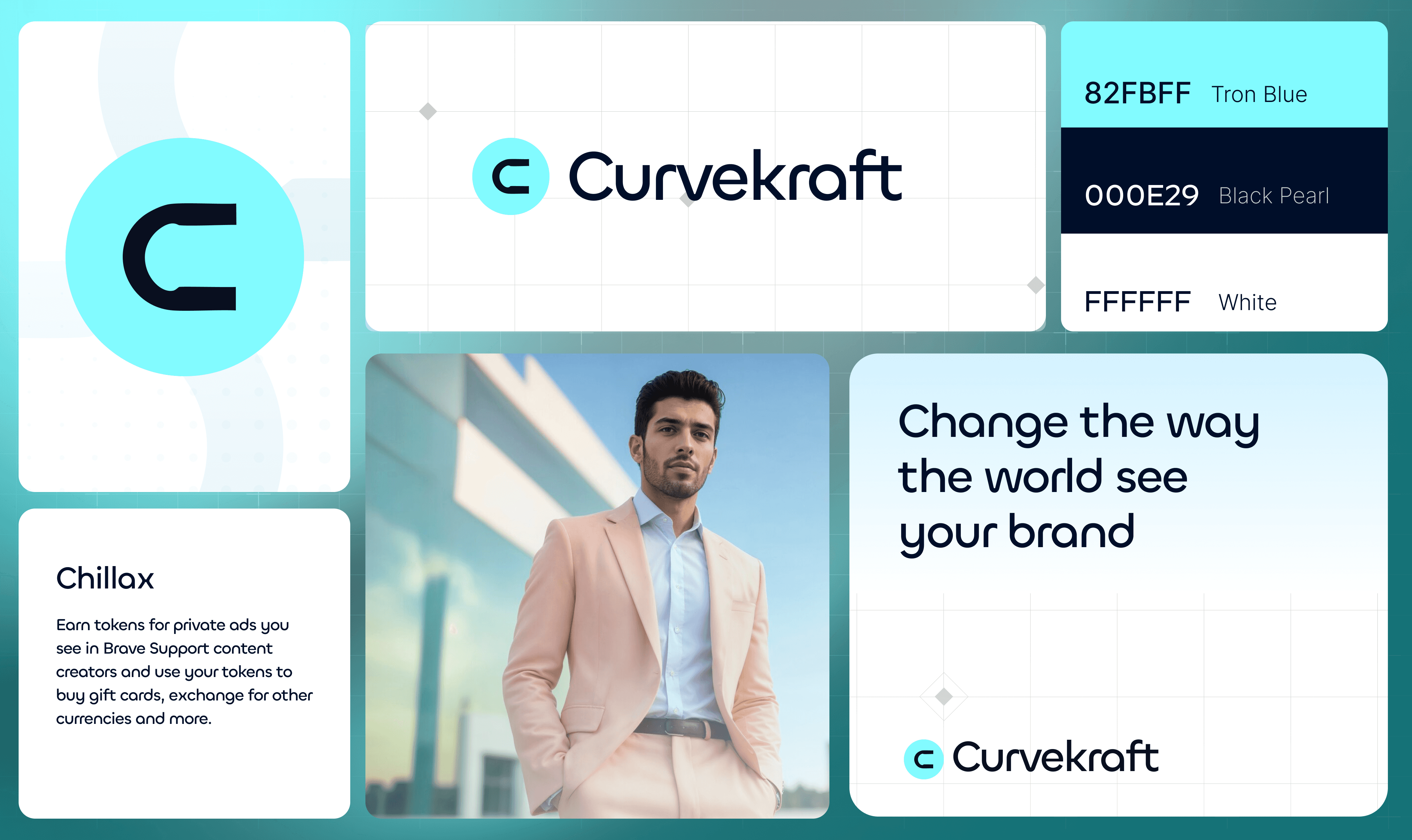
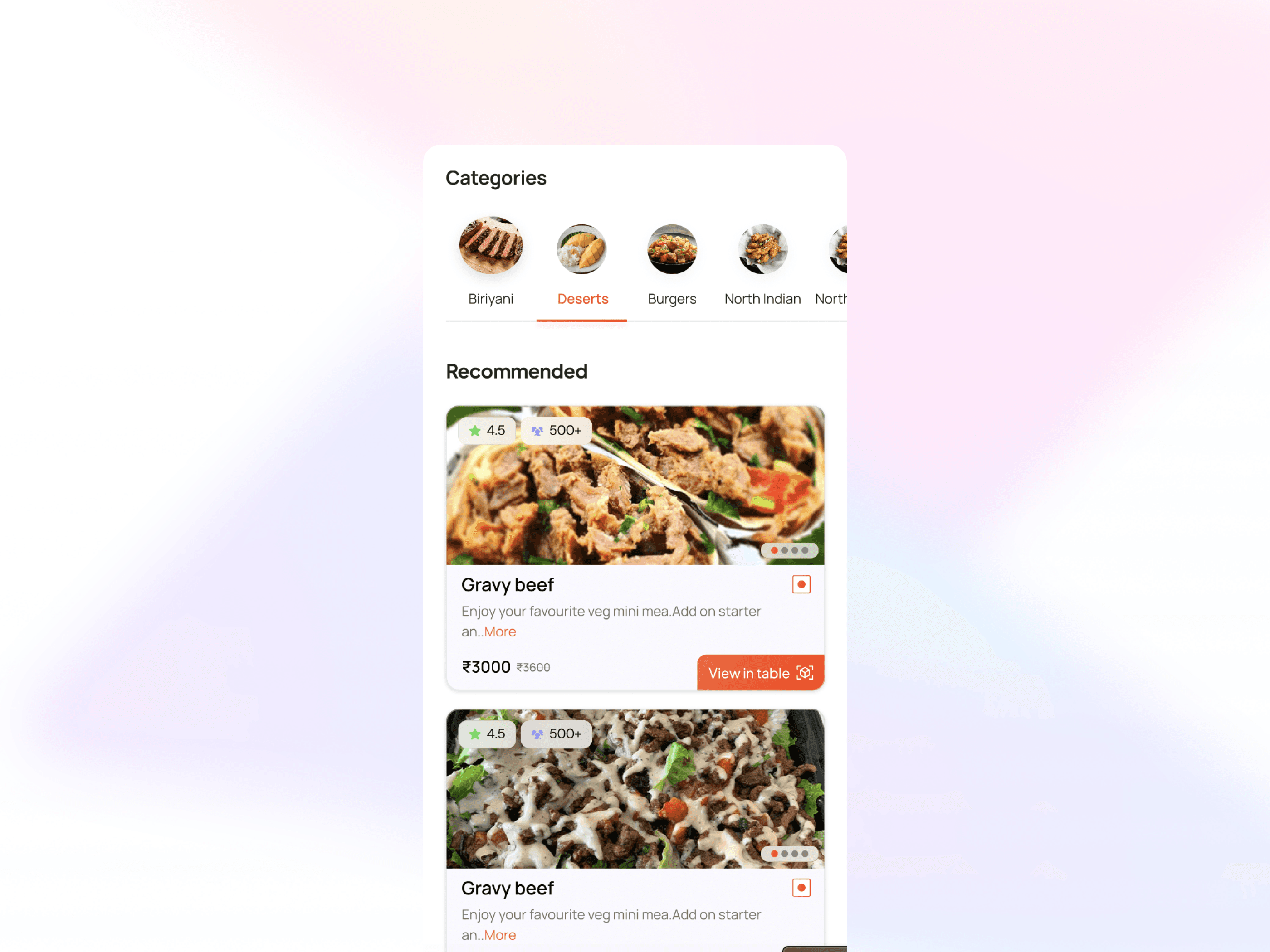

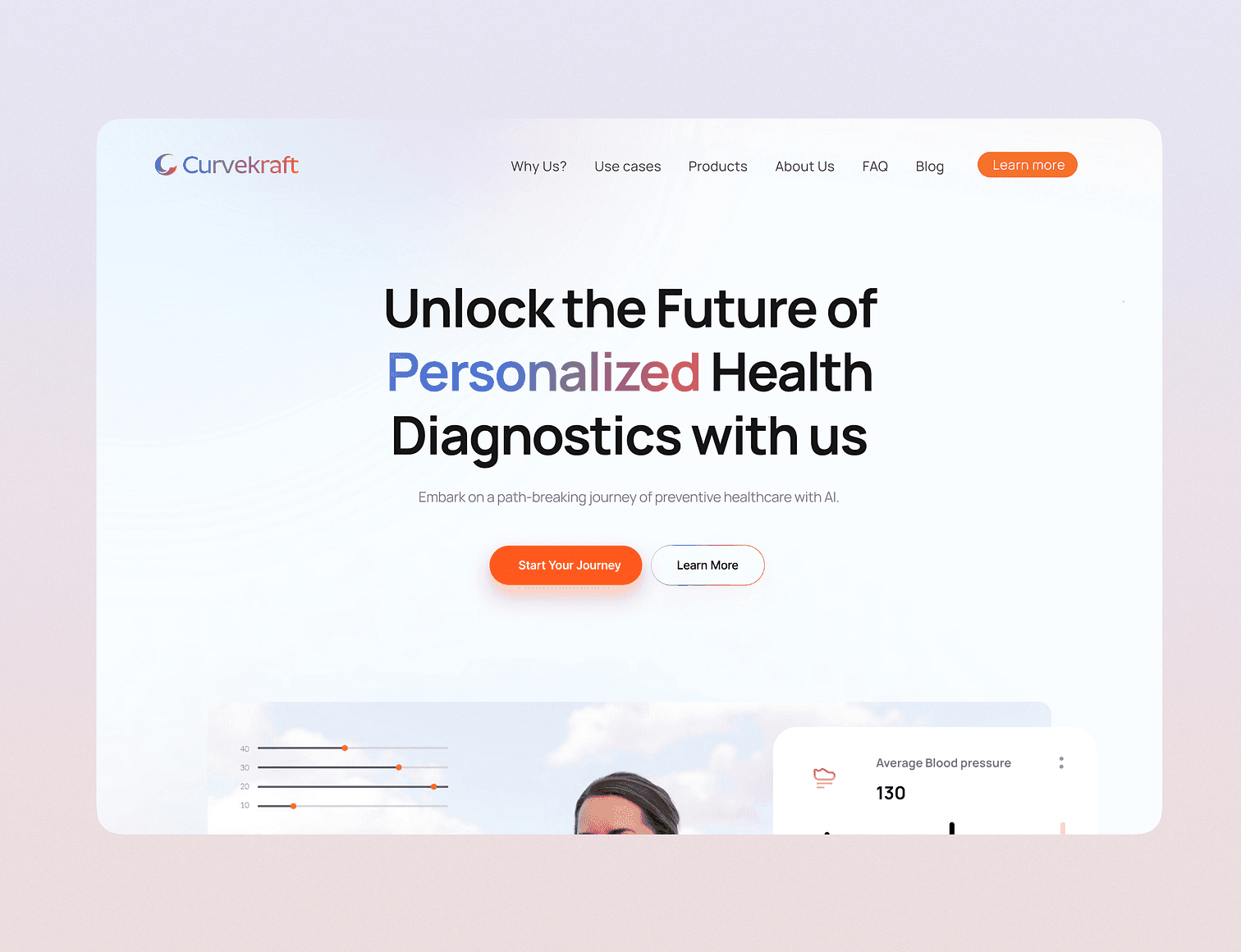
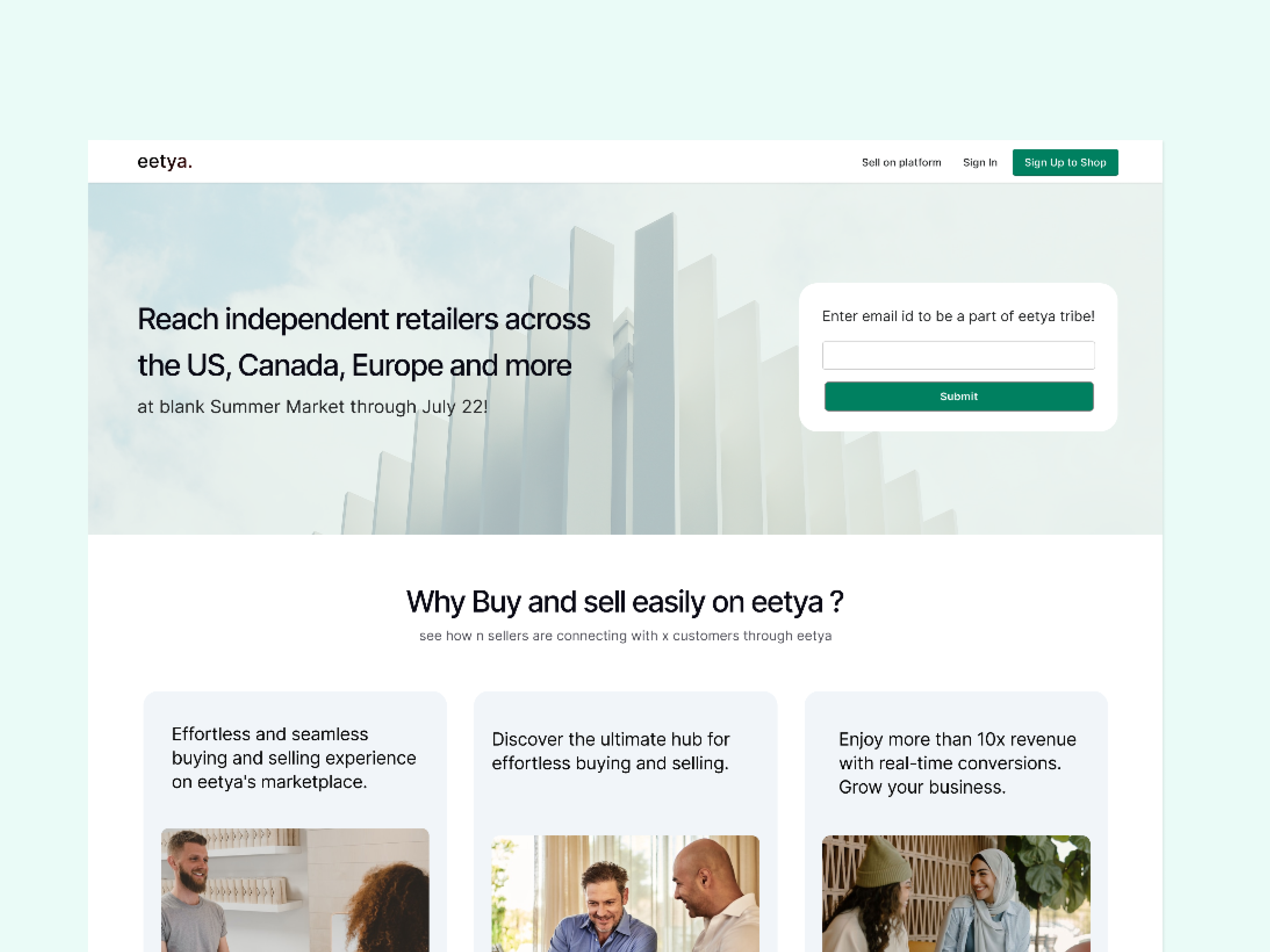
Side projects and experiments, built in a few days, a few weeks or a few months.


A workspace for developers and AI engineers to create, test, compare, version and release prompts used by their AI agents.
View case studyRedesigned customer and admin experiences for a B2B workforce management platform, simplifying fulfillment, user management, request tracking and operations. This case study covers the Outreach Campaigns module.
View case study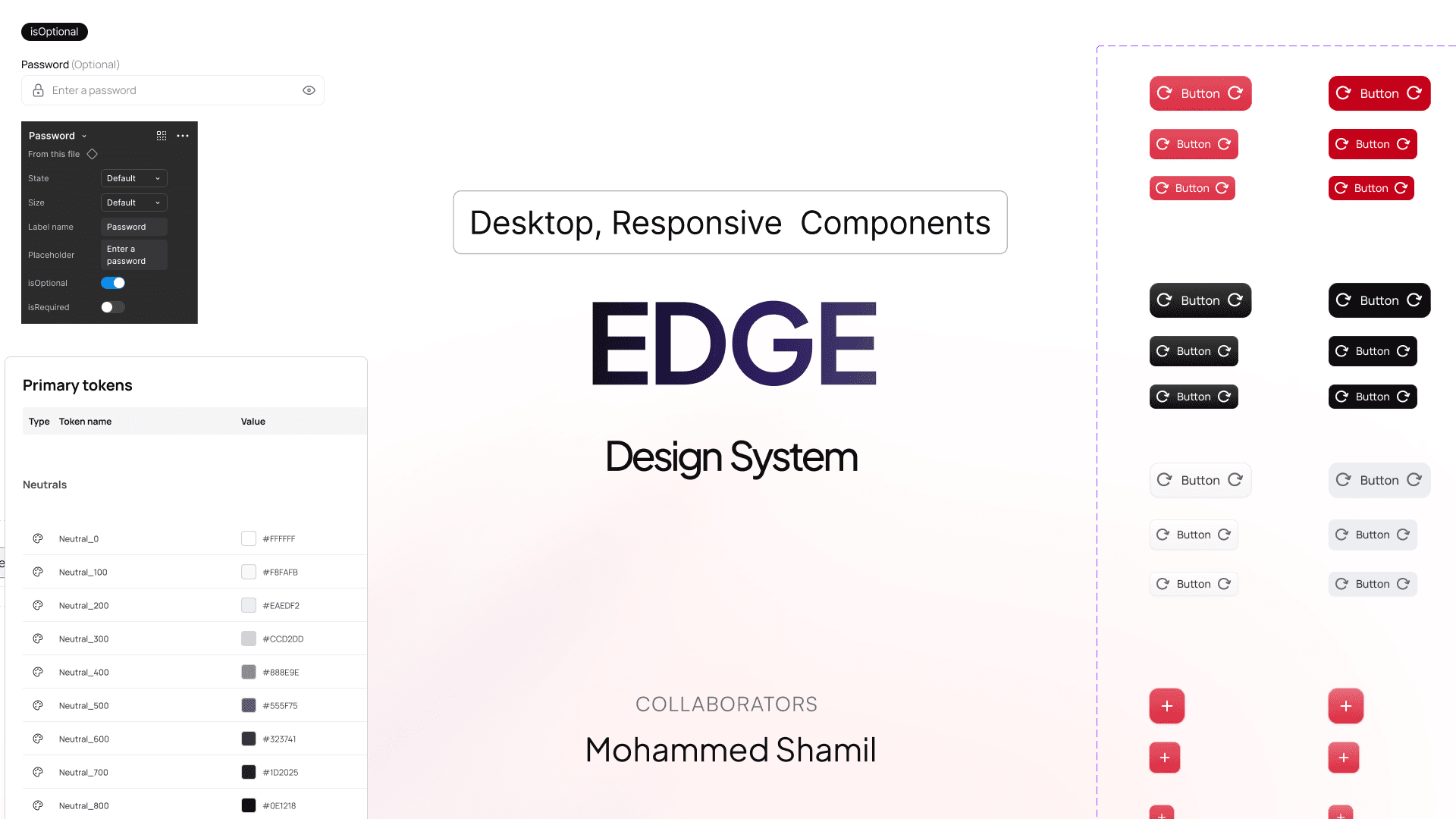
Created and organized components, style guides and design tokens to scale the design system across multiple workforce broker products.
Reach out to me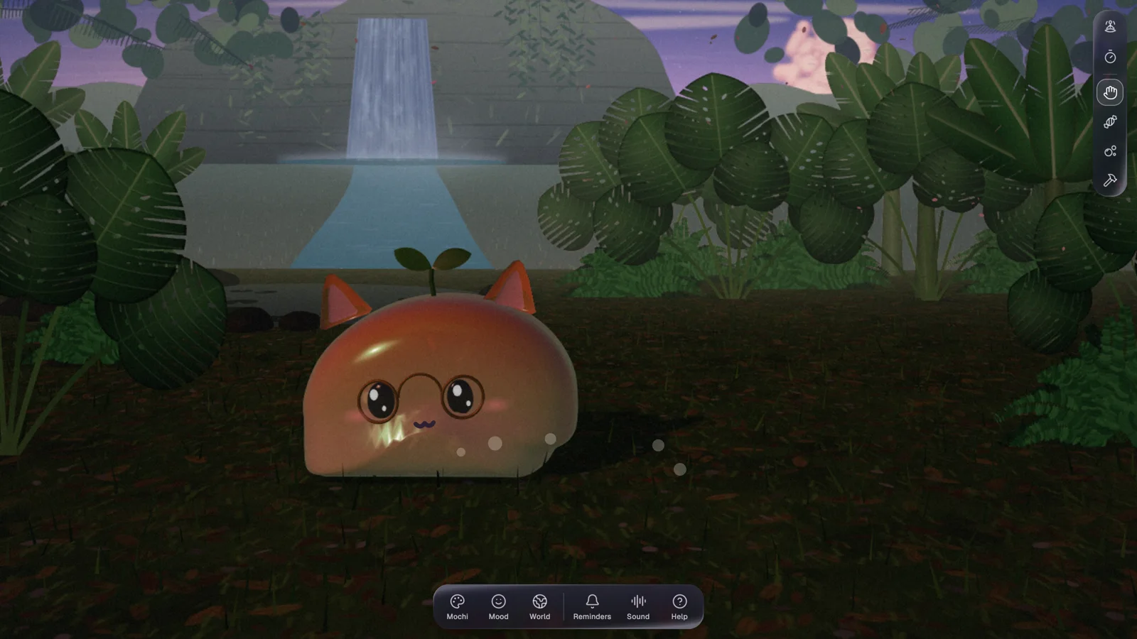
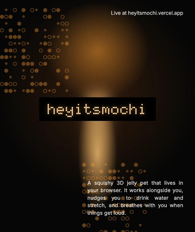
A squishy 3D jelly pet that lives in your browser. It works alongside you, nudges you to drink water and stretch, and breathes with you when things get loud.
View detail
Product Designer · Kochi, Kerala
Product Designer with around 4 years designing digital products end to end, specializing in product thinking and business-aligned design for SaaS and enterprise.
Not every journey follows a straight path—mine certainly didn’t.
Back in school, I was deep into biology, aiming for a career in medicine. A year of entrance coaching later, I realized stethoscopes weren’t my thing. So, I pivoted to engineering at CUSAT, where I spent four years trying (and failing) to fall in love with coding. But somewhere between debugging errors and late-night project submissions, I discovered design—a space where logic met creativity, and things just clicked.
My first real taste of design came at TinkerHub, a student-led tech community that encouraged experimentation. As a Media Intern, I worked on social media campaigns, creating visuals that made tech concepts accessible to students. More importantly, I learned the value of community-driven learning—a lesson that stayed with me.
Then came Zu Technologies, where I worked as a Graphic Design Intern, crafting creatives, social media visuals, and marketing materials. This was where design stopped being just an interest and started feeling like a career. Leading discussions with stakeholders, aligning visuals with business goals, and strategizing for engagement gave me a whole new perspective on design’s role in storytelling and brand building.
Post-graduation, I landed at Mitsogo (Hexnode), a product company in Chennai, where I truly honed my UI/UX craft. But beyond work, I found something just as valuable—friendships with teammates, developers and QA. We bonded over chai breaks, weekend explorations, and spontaneous road trips to places like Kanchipuram and Mumbai. Chennai, with its café-hopping culture and endless conversations, became a second home.
The next shift took me from a product company to a service-based agency—Sketch Brahma in Bangalore. Here, I got the chance to work across multiple domains, exploring new industries, solving different UX challenges, and adapting to a fast-paced design process. It was no longer about just one product but about crafting experiences for multiple clients, each with its own story.
Then came Keyvalue Software Systems, back home in Kochi. Here I’m designing Netra, an LLM observability platform, which pulled me deep into the rabbit hole of AI observability: traces, evaluations, prompts and everything that keeps AI agents honest. Along the way I helped organise an entire hackathon, pitching in with design for everything it needed.
This is also where I pushed myself to the limit. I became a bit of a vibe builder, exploring every design and dev tool I could get my hands on, shipping fast and learning even faster.
Through every unexpected turn—from biology to engineering to design, from product to service, from one city to another—one thing has remained constant: curiosity. Whether it’s designing an app, collaborating with developers, or figuring out my next weekend getaway, I believe the best things come from exploration, experimentation, and embracing the unplanned.
And that’s exactly how I approach design—by staying curious, adaptive, and open to the next big challenges, whether it’s new products or revamping existing ones.








I work with founders, studios, and growing teams who value clarity, structure, and thoughtful digital design.
Both. I collaborate with early-stage startups as well as established teams, adapting my process to fit each stage.
Yes. I often refine, extend, or rebuild existing brands and digital systems while respecting what already works.
You’ll be involved at key stages through clear check-ins and reviews, without unnecessary meetings or back-and-forth.
A clear brief, goals, and timelines are enough to begin. I help shape the rest as the project progresses.